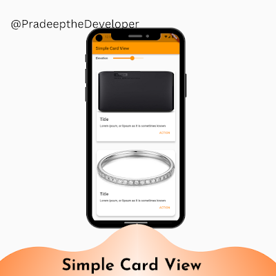
In this blog post, we'll explore how to create a simple card view in Flutter using the `Card` widget. We'll also implement a slider to control the elevation of the cards, allowing for interactive customization.
Introduction
Flutter is a powerful framework for building cross-platform mobile, web, and desktop applications. It provides a rich set of widgets that can be used to create beautiful and interactive user interfaces. One such widget is the `Card` widget, which is commonly used to display information in a visually appealing way.
Creating the SimpleCardScreen
Let's start by defining a Flutter `StatefulWidget` called `SimpleCardScreen`. This widget will serve as the main entry point for our card view. Here's the code for the `SimpleCardScreen`:
class SimpleCardScreen extends StatefulWidget {
  @override
  _SimpleCardScreenState createState() => _SimpleCardScreenState();
}

class _SimpleCardScreenState extends State<SimpleCardScreen> {
  double _elevation = 2;

  @override
  Widget build(BuildContext context) {
    return Scaffold(
      appBar: AppBar(title: const Text('Simple Card View')),
      body: ListView(
        padding: const EdgeInsets.all(0),
        children: <Widget>[
          // Slider widget to control the elevation
          Container(
            margin: const EdgeInsets.all(16),
            child: Row(
              children: <Widget>[
                const Text(
                  "Elevation",
                  style: TextStyle(fontWeight: FontWeight.w600),
                ),
                Slider(
                  value: _elevation,
                  min: 0,
                  max: 10,
                  label: _elevation.toStringAsFixed(1),
                  onChanged: (value) {
                    setState(
                      () {
                        _elevation = value;
                      },
                    );
                  },
                ),
              ],
            ),
          ),
          // SimpleCard widget
          Container(
            margin: const EdgeInsets.all(16),
            child: _SimpleCard(
              elevation: _elevation,
            ),
          ),
          // CircularCard widget
          Container(
            margin: const EdgeInsets.all(16),
            child: _CircularCard(
              elevation: _elevation,
            ),
          ),
        ],
      ),
    );
  }
}
The `SimpleCardScreen` is a stateful widget that maintains the `_elevation` value, which represents the elevation of the cards. It provides a slider widget that allows the user to adjust the elevation dynamically. The screen also includes two containers, each containing a different card widget: `_SimpleCard` and `_CircularCard`.
Creating the _SimpleCard Widget
Next, let's define the `_SimpleCard` widget, which extends `StatefulWidget`. This widget represents a rectangular card with an image, title, description, and an action button. Here's the code for the `_SimpleCard`:
class _SimpleCard extends StatefulWidget {
  final double elevation;

  const _SimpleCard({Key? key, this.elevation = 1}) : super(key: key);

  @override
  _SimpleCardState createState() => _SimpleCardState();
}

class _SimpleCardState extends State<_SimpleCard> {
  late ThemeData theme;

  @override
  Widget build(BuildContext context) {
    theme = Theme.of(context);
    return Card(
      elevation: widget.elevation,
      child: Column(
        crossAxisAlignment: CrossAxisAlignment.start,
        children: <Widget>[
          // Image
          Image(
            image: const NetworkImage(
              'https://fakestoreapi.com/img/61IBBVJvSDL._AC_SY879_.jpg',
            ),
            height: 200,
            width: MediaQuery.of(context).size.width,
            fit: BoxFit.fill,
          ),
          // Content
          Container(
            padding: const EdgeInsets.all(16),
            child: Column(
              crossAxisAlignment: CrossAxisAlignment.start,
              children: <Widget>[
                Column(
                  crossAxisAlignment: CrossAxisAlignment.start,
                  children: <Widget>[
                    // Title
                    const Text(
                      "Title",
                      style: TextStyle(
                        fontWeight: FontWeight.w600,
                        fontSize: 20,
                      ),
                    ),
                    const SizedBox(height: 12),
                    // Description
                    const Text(
                      "Lorem ipsum, or lipsum as it is sometimes known",
                      style: TextStyle(
                        fontWeight: FontWeight.w500,
                        height: 1.2,
                      ),
                    ),
                    // Action button
                    Container(
                      alignment: Alignment.centerRight,
                      child: TextButton(
                        onPressed: () {},
                        child: const Text(
                          "ACTION",
                          style: TextStyle(
                            fontWeight: FontWeight.w500,
                            color: Colors.orange,
                          ),
                        ),
                      ),
                    ),
                  ],
                ),
              ],
            ),
          ),
        ],
      ),
    );
  }
}
The `_SimpleCard` widget represents a rectangular card with an image, title, description, and an action button. It extends `StatefulWidget` to manage the elevation value received from its parent widget. The card's appearance is defined using the `Card` widget, and its content is structured using various other Flutter widgets like `Image`, `Text`, `Container`, and `Column`.
Creating the _CircularCard Widget
Lastly, let's define the `_CircularCard` widget, which extends `StatefulWidget`. This widget represents a circular card with an image, title, description, and an action button. Here's the code for the `_CircularCard`:
class _CircularCard extends StatefulWidget {
  final double elevation;

  const _CircularCard({Key? key, this.elevation = 1}) : super(key: key);

  @override
  _CircularCardState createState() => _CircularCardState();
}

class _CircularCardState extends State<_CircularCard> {
  late ThemeData theme;

  @override
  Widget build(BuildContext context) {
    theme = Theme.of(context);
    return Card(
      elevation: widget.elevation,
      clipBehavior: Clip.antiAliasWithSaveLayer,
      shape: RoundedRectangleBorder(
        borderRadius: BorderRadius.circular(16.0),
      ),
      child: Column(
        crossAxisAlignment: CrossAxisAlignment.start,
        children: <Widget>[
          // Image
          Image(
            image: const NetworkImage(
              'https://fakestoreapi.com/img/61sbMiUnoGL._AC_UL640_QL65_ML3_.jpg',
            ),
            height: 180,
            width: MediaQuery.of(context).size.width,
            fit: BoxFit.fill,
          ),
          // Content
          Container(
            padding: const EdgeInsets.all(16),
            child: Column(
              crossAxisAlignment: CrossAxisAlignment.start,
              children: <Widget>[
                Column(
                  crossAxisAlignment: CrossAxisAlignment.start,
                  children: <Widget>[
                    // Title
                    const Text(
                      "Title",
                      style: TextStyle(
                        fontWeight: FontWeight.w600,
                        fontSize: 20,
                      ),
                    ),
                    const SizedBox(height: 12),
                    // Description
                    const Text(
                      "Lorem ipsum, or lipsum as it is sometimes known",
                      style: TextStyle(
                        fontWeight: FontWeight.w500,
                        height: 1.2,
                      ),
                    ),
                    // Action button
                    Container(
                      alignment: Alignment.centerRight,
                      child: TextButton(
                        onPressed: () {},
                        child: const Text(
                          "ACTION",
                          style: TextStyle(
                            fontWeight: FontWeight.w500,
                            color: Colors.orange,
                          ),
                        ),
                      ),
                    ),
                  ],
                ),
              ],
            ),
          ),
        ],
      ),
    );
  }
}
The `_CircularCard` widget represents a circular card with an image, title, description, and an action button. It extends `StatefulWidget` to manage the elevation value received from its parent widget. The card's appearance is defined using the `Card` widget, with additional properties like `clipBehavior` and `shape` to give it a circular shape. The content of the card is structured similar to the `_SimpleCard` widget.
Conclusion
In this blog post, we learned how to create a simple card view in Flutter using the `Card` widget. We explored two variations of the card: rectangular and circular. We also implemented a slider to control the elevation of the cards, allowing for interactive customization.
Flutter provides a wide range of widgets and customization options, making it a powerful framework for building rich and engaging user interfaces. With the knowledge gained from this blog post, you can now create your own card views and further enhance them with additional features and styling.


