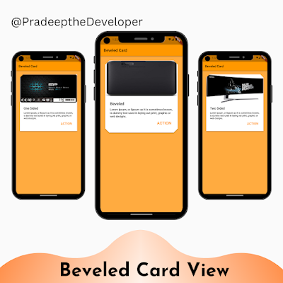
In Flutter, cards are a common UI element used to display content in a structured and visually appealing manner. While Flutter provides a default Card widget, sometimes you may want to customize its appearance to make it stand out. One way to achieve this is by using beveled borders, which can add a unique and modern touch to your card designs. In this tutorial, we'll explore how to create custom card views with beveled borders using Flutter.
Code Explanation:
The provided code demonstrates the implementation of three different beveled card views: `_BeveledCard`, `_OneSidedBeveledCard`, and `_TwoSidedBeveledCard`. Each card has a unique design and is built using Flutter widgets such as Card, Container, Column, Image, Text, and TextButton. The `BeveledRectangleBorder` class is used to define the beveled shape of the card borders, and various properties such as padding, alignment, and styling are applied to enhance the overall visual presentation.
class BeveledCard extends StatefulWidget {
  @override
  _BeveledCardState createState() => _BeveledCardState();
}

class _BeveledCardState extends State<BeveledCard> {
  @override
  Widget build(BuildContext context) {
    return Scaffold(
        backgroundColor: Colors.orangeAccent,
        appBar: AppBar(title: Text('Beveled Card')),
        body: ListView(
          padding: EdgeInsets.all(0),
          children: <Widget>[
            Container(
                padding: EdgeInsets.all(24), child: _OneSidedBeveledCard()),
            Container(
                padding: EdgeInsets.all(24), child: _TwoSidedBeveledCard()),
            Container(padding: EdgeInsets.all(24), child: _BeveledCard()),
          ],
        ));
  }
}

class _BeveledCard extends StatelessWidget {
  @override
  Widget build(BuildContext context) {
    return Card(
      margin: EdgeInsets.all(0),
      elevation: 4,
      clipBehavior: Clip.antiAliasWithSaveLayer,
      shape: BeveledRectangleBorder(
        borderRadius: BorderRadius.circular(20),
      ),
      child: Column(
        crossAxisAlignment: CrossAxisAlignment.start,
        children: <Widget>[
          Image(
            image: NetworkImage(
                'https://fakestoreapi.com/img/61IBBVJvSDL._AC_SY879_.jpg'),
            height: 180,
            width: MediaQuery.of(context).size.width,
            fit: BoxFit.fill,
          ),
          Container(
            padding: EdgeInsets.all(24),
            child: Column(
              crossAxisAlignment: CrossAxisAlignment.start,
              children: <Widget>[
                Column(
                  crossAxisAlignment: CrossAxisAlignment.start,
                  children: <Widget>[
                    Text(
                      "Beveled",
                      style: TextStyle(
                        fontWeight: FontWeight.w600,
                        fontSize: 20,
                      ),
                    ),
                    SizedBox(
                      height: 10,
                    ),
                    Text(
                      "Lorem ipsum, or lipsum as it is sometimes known, is dummy text used in laying out print, graphic or web designs.",
                      style:
                          TextStyle(height: 1.2, fontWeight: FontWeight.w500),
                    ),
                    Container(
                      alignment: Alignment.centerRight,
                      child: TextButton(
                          onPressed: () {},
                          child: Text(
                            "ACTION",
                            style: TextStyle(
                                fontWeight: FontWeight.w600, fontSize: 20),
                          )),
                    )
                  ],
                ),
              ],
            ),
          )
        ],
      ),
    );
  }
}

class _OneSidedBeveledCard extends StatelessWidget {
  @override
  Widget build(BuildContext context) {
    return Card(
      margin: EdgeInsets.all(0),
      elevation: 4,
      clipBehavior: Clip.antiAliasWithSaveLayer,
      shape: BeveledRectangleBorder(
        borderRadius: BorderRadius.only(topLeft: Radius.circular(20)),
      ),
      child: Column(
        crossAxisAlignment: CrossAxisAlignment.start,
        children: <Widget>[
          Image(
            image: NetworkImage(
                'https://fakestoreapi.com/img/71kWymZ+c+L._AC_SX679_.jpg'),
            height: 180,
            width: MediaQuery.of(context).size.width,
            fit: BoxFit.fill,
          ),
          Container(
            padding: EdgeInsets.all(24),
            child: Column(
              crossAxisAlignment: CrossAxisAlignment.start,
              children: <Widget>[
                Column(
                  crossAxisAlignment: CrossAxisAlignment.start,
                  children: <Widget>[
                    Text("One Sided",
                        style: TextStyle(
                            fontWeight: FontWeight.w600, fontSize: 20)),
                    SizedBox(
                      height: 10,
                    ),
                    Text(
                        "Lorem ipsum, or lipsum as it is sometimes known, is dummy text used in laying out print, graphic or web designs.",
                        style: TextStyle(
                            height: 1.2, fontWeight: FontWeight.w500)),
                    Container(
                      alignment: Alignment.centerRight,
                      child: TextButton(
                          onPressed: () {},
                          child: Text(
                            "ACTION",
                            style: TextStyle(
                                fontWeight: FontWeight.w600, fontSize: 20),
                          )),
                    )
                  ],
                ),
              ],
            ),
          )
        ],
      ),
    );
  }
}

class _TwoSidedBeveledCard extends StatelessWidget {
  @override
  Widget build(BuildContext context) {
    return Card(
      margin: EdgeInsets.all(0),
      elevation: 4,
      clipBehavior: Clip.antiAliasWithSaveLayer,
      shape: BeveledRectangleBorder(
        borderRadius: BorderRadius.only(
            topLeft: Radius.circular(20), topRight: Radius.circular(20)),
      ),
      child: Column(
        crossAxisAlignment: CrossAxisAlignment.start,
        children: <Widget>[
          Image(
            image: NetworkImage(
                'https://fakestoreapi.com/img/81Zt42ioCgL._AC_SX679_.jpg'),
            height: 180,
            width: MediaQuery.of(context).size.width,
            fit: BoxFit.fill,
          ),
          Container(
            padding: EdgeInsets.all(24),
            child: Column(
              crossAxisAlignment: CrossAxisAlignment.start,
              children: <Widget>[
                Column(
                  crossAxisAlignment: CrossAxisAlignment.start,
                  children: <Widget>[
                    Text("Two Sided",
                        style: TextStyle(
                            fontWeight: FontWeight.w600, fontSize: 20)),
                    SizedBox(
                      height: 10,
                    ),
                    Text(
                        "Lorem ipsum, or lipsum as it is sometimes known, is dummy text used in laying out print, graphic or web designs.",
                        style: TextStyle(
                            height: 1.2, fontWeight: FontWeight.w500)),
                    Container(
                      alignment: Alignment.centerRight,
                      child: TextButton(
                          onPressed: () {},
                          child: Text(
                            "ACTION",
                            style: TextStyle(
                                fontWeight: FontWeight.w600, fontSize: 20),
                          )),
                    )
                  ],
                ),
              ],
            ),
          )
        ],
      ),
    );
  }
}
Building the Beveled Card App:
The app starts with the `MyApp` class, which is the entry point of the application. It extends `StatelessWidget` and creates a `MaterialApp` as the root widget. The `MaterialApp` sets the app's title and theme, and its home property is set to an instance of the `BeveledCard` class, which serves as the main screen of the app.
The `BeveledCard` class is a stateful widget that extends `StatefulWidget`. It overrides the `build` method to construct the app's UI. Inside the `build` method, a `Scaffold` widget is used as the main container, providing a background color and an `AppBar` with a title. The body of the `Scaffold` is a `ListView` containing three instances of `Container`, each containing a different type of beveled card view.
Each beveled card view is implemented as a separate widget: `_BeveledCard`, `_OneSidedBeveledCard`, and `_TwoSidedBeveledCard`. These widgets extend `StatelessWidget` and define the visual appearance and structure of their respective card views. They utilize the `Card` widget as the base container and apply the `BeveledRectangleBorder` shape to achieve the beveled borders.
The `_BeveledCard` widget represents a card with beveled borders on all sides. It includes an image, a title, a description, and an action button. Similarly, the `_OneSidedBeveledCard` and `_TwoSidedBeveledCard` widgets have a similar structure but differ in the shape of their beveled borders.
Conclusion:
In this tutorial, we explored how to create custom card views with beveled borders using Flutter. We examined the provided code, which showcased three different beveled card designs. By leveraging the `Card` widget, the `BeveledRectangleBorder` shape, and other Flutter widgets, we were able to create visually appealing card views with unique beveled borders. You can further enhance these designs by customizing the content, styling, and interaction of the cards to match the specific requirements of your Flutter app.


